


With social media websites growing vastly, it’s easy to start promoting your business day one. Basically, you design a cool ad, the way you want it, pay Facebook to promote it and wallah your done… Except one small thing, Facebook basically decides how much you can really say in the design of your ad. If it’s not to their guidelines, Facebook will slap you in the face with with the red DENY stamp.

I am Ryan Brennan an interactive designer at Milk Street Marketing and not too long ago I thought creating a Facebook ad design was eezypeezy. I abruptly learned (after spending the time designing a well thought out ad) that your ad actually has a text limit, and I don’t mean curse words or dirty innuendos. Your ad is actually limited to a 20% use of text. Think about it, this could entirely ruin your campaign and advertisements depending on what you designed. So I am going to give you a few considerations on how to prepare yourself for advertising on Facebook, and possibly other sites your interested in advertising on.
The reason why I decided to write about this text limit issue is because a designer may have ads strictly based on large type or small background type to express their ad. Forget about it. I highly consider turning towards an ad that is mainly expressed through an image and one or two lines of small copy (at least for Facebook). I hope your reading this before you being design a highly text based ad because I know time is valuable and your time will be killed if you have to start over. If you really need long amounts of text, I suggest putting it in the text box Facebook provides you beneath your image. It can help with getting your ad approved, put little text in your image and the rest in the text box outside the image that they provide. If your ad needs very small type explaining maybe rules or terms about what your advertising, it’s going to take up a lot of the small 20% of text your ad can have. I would leave that out and include it into the ad page itself.
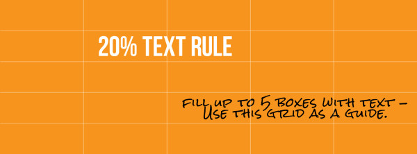
Lastly, when deciding how your text will be displayed in your ad, make sure you keep all the text relatively tight, like your trying to fit it in a rectangle or box. I say this because Facebook divides your ad into 25 squares and your text can only exist in 5 of those squares. So, having type spread out within your ad, is unlikely to help you get it approved.
Facebook wants to keep their website looking spam free, so you have to work within their guidelines when using text in your ads. Hopefully you can strategically create your ad with these suggestions and your time wont be wasted.
Here is a link that Facebook provides that will help you get your ad text down to 20% of your image: https://www.facebook.com/ads/tools/text_overlay.